Student Work
Illustrator, InDesign, Photoshop
Assignment:
Choose a local shop to rebrand. Re-do their entire identity system including logo, branding kit and expressions.
Process:
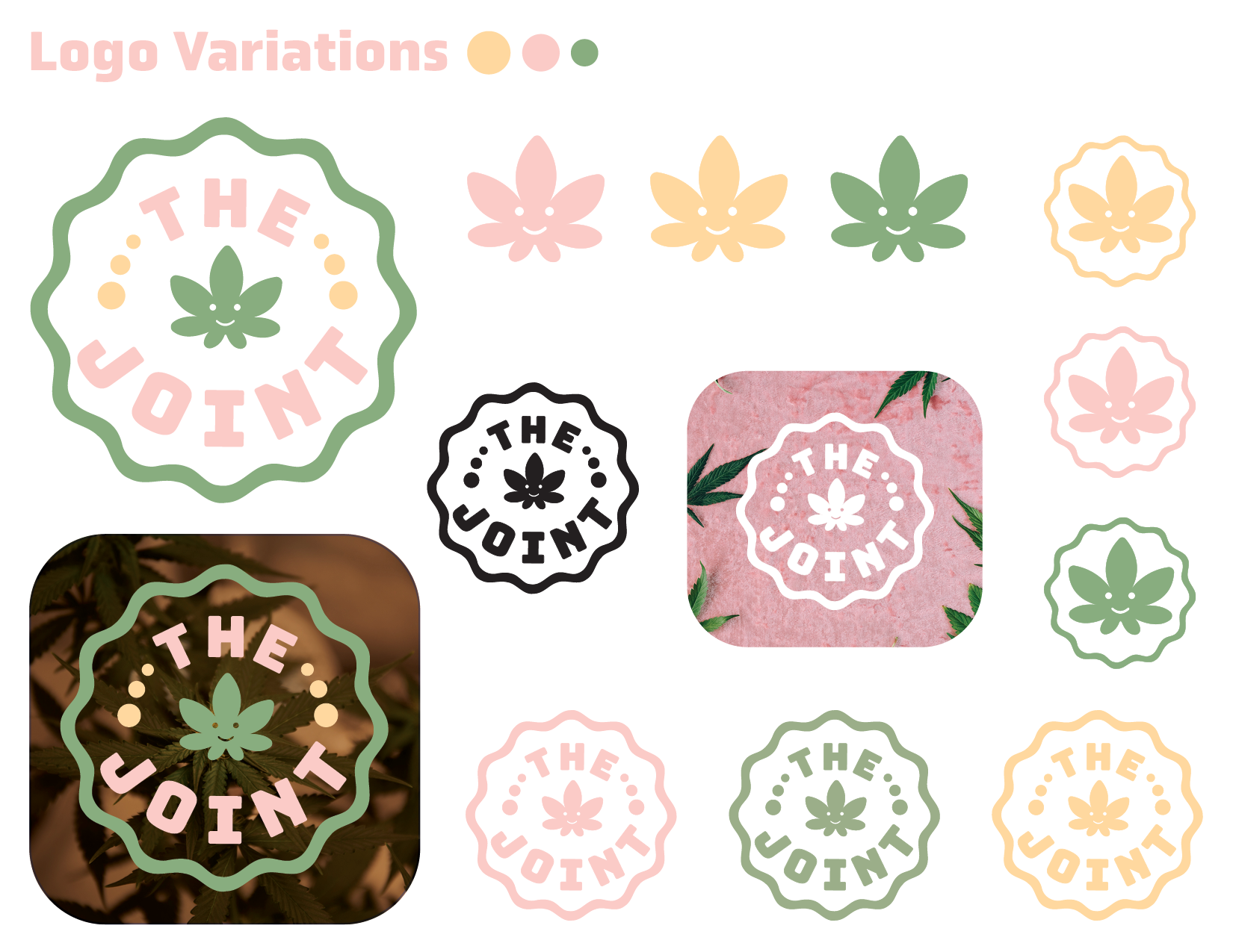
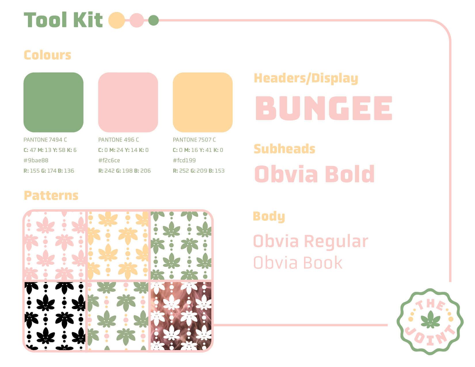
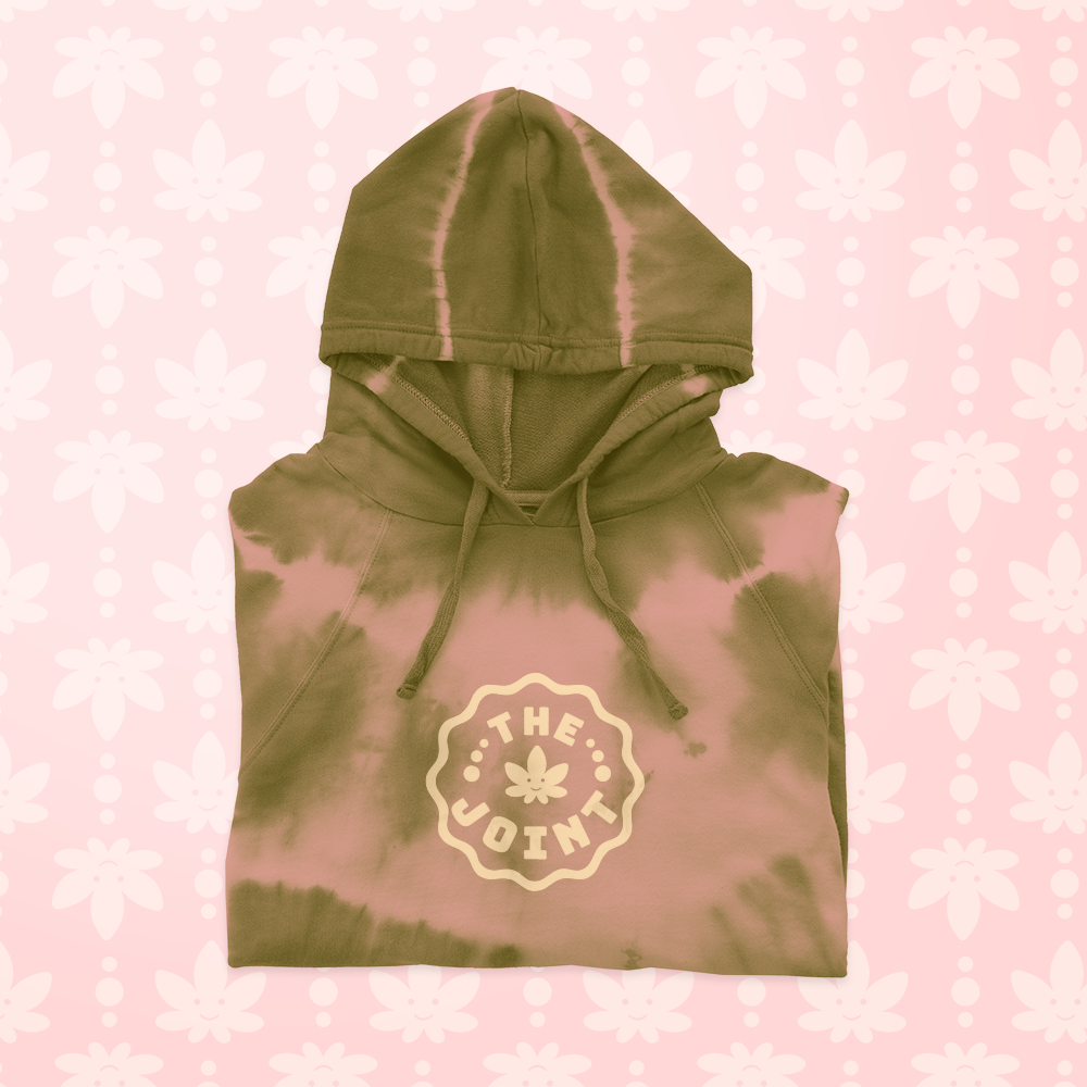
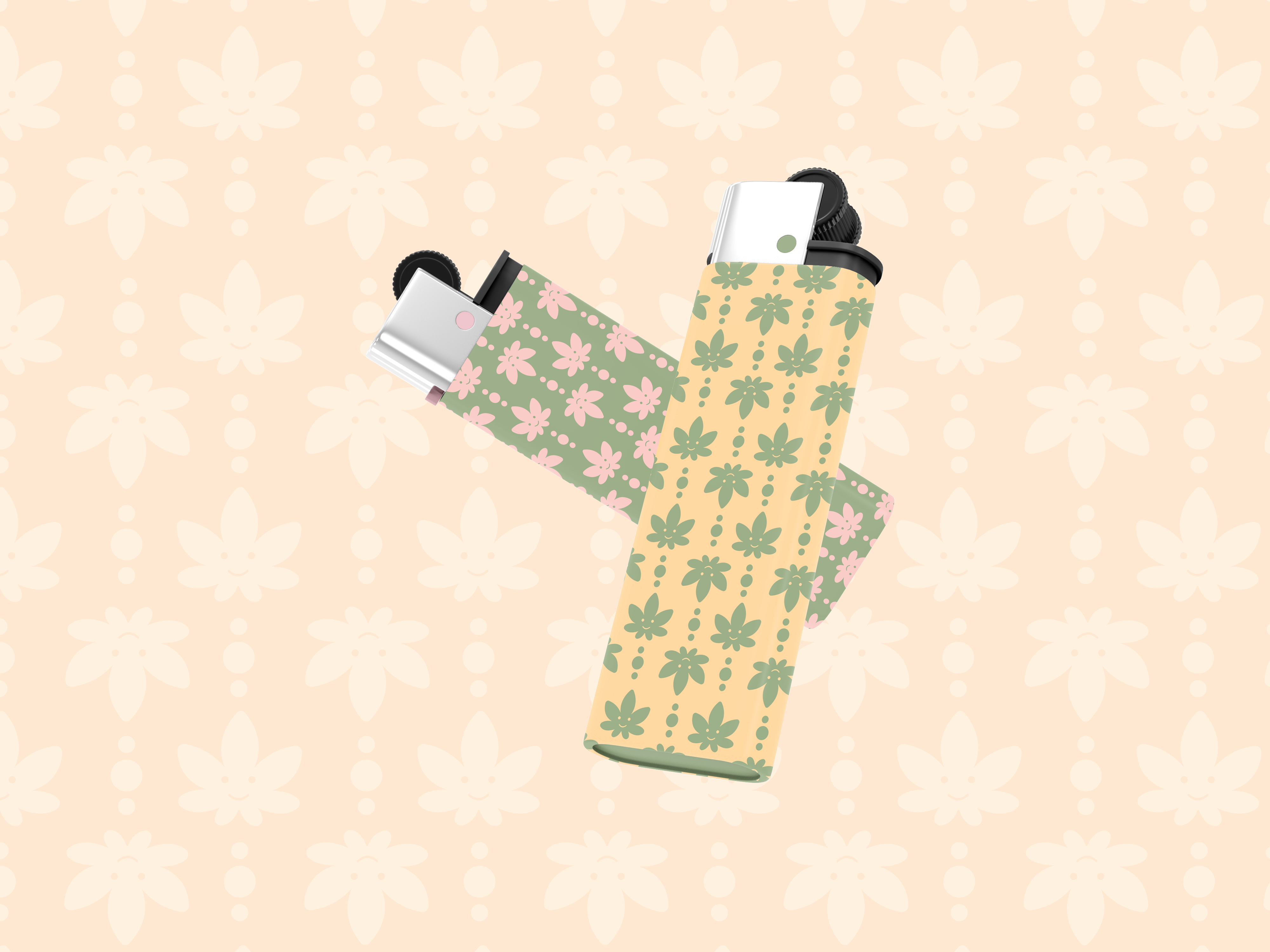
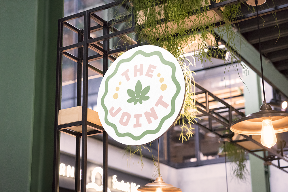
The goal for this rebrand was to achieve a warmer, more inviting appearance to match The Joint’s service and products. The aesthetic is inspired by the 70’s era of design. Brighter colours were incorporated but slightly dulled to help with that vintage effect.
The logo is friendly and welcoming, while still having a bit of an edge. The fonts used are structured yet funky and have a soft feel as well. All this plays into the design of the rebrand, giving The Joint a fresh, playful, groovy and easy-going vibe.
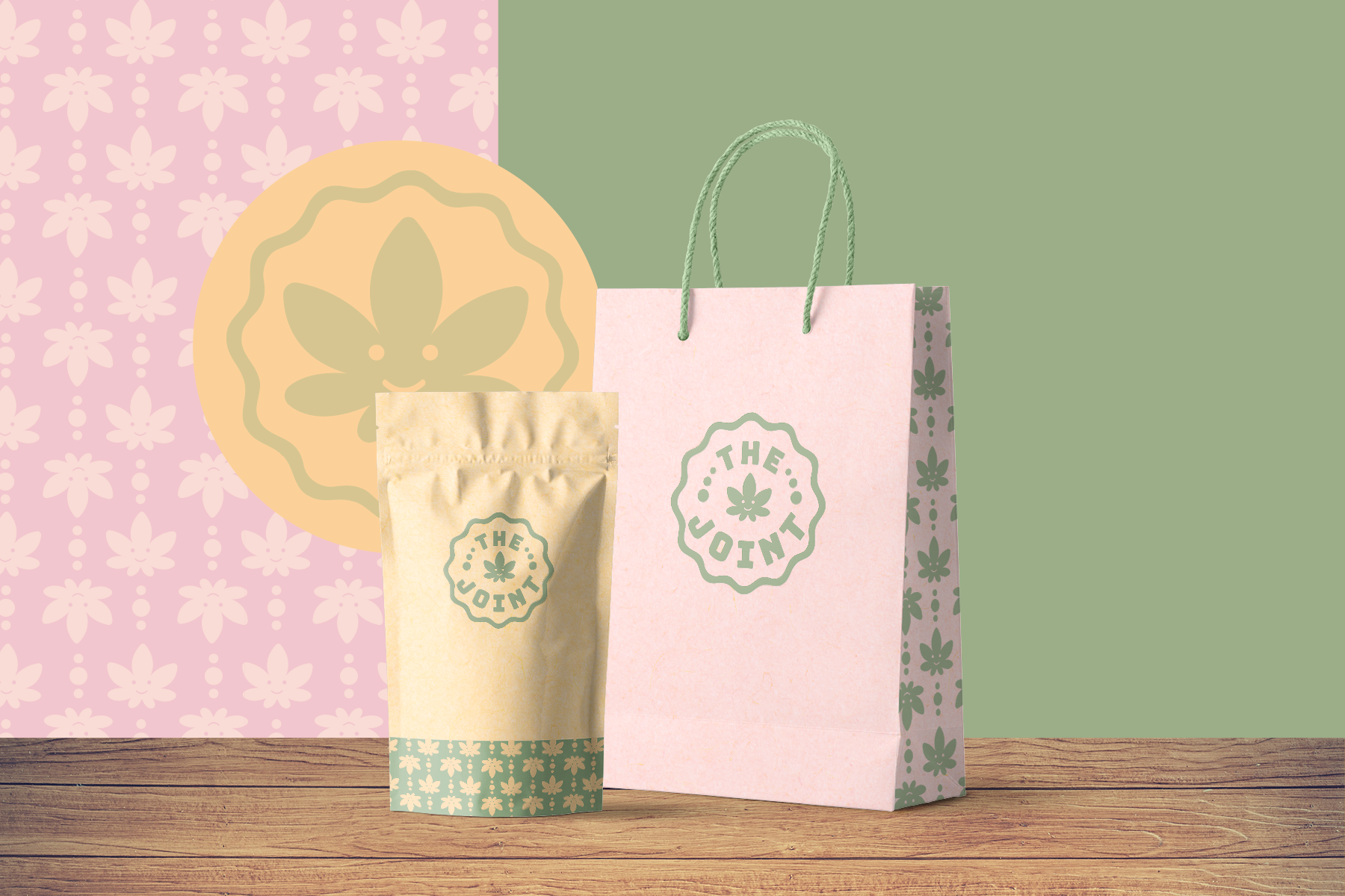
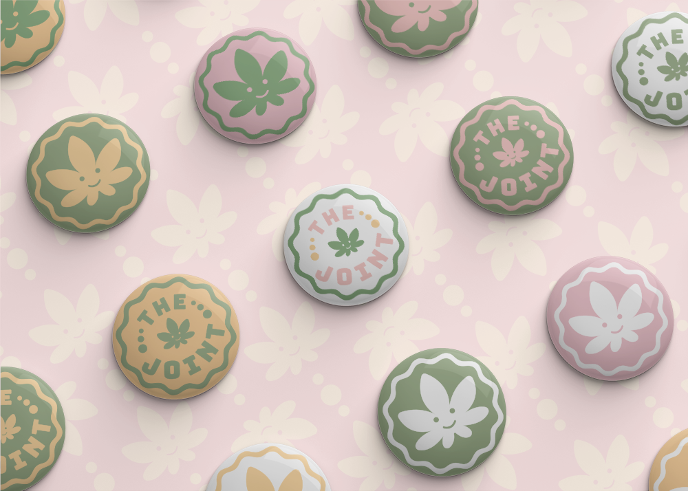
Product
This new, fun, bold yet soft identity for The Joint transforms the mood of the brand into a friendlier, more playful and more consistent experience.